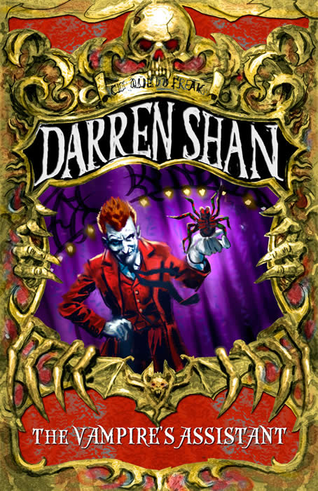
Book 1 : 3rd edition - rough
UK & Ireland

This was an early mock-up for the 3rd generation cover of Cirque Du Freak (note the incorrect title here, which was used just to get an idea of how the lettering would look). While I was quite happy with it, I didn't like the look of Madam Octa -- she looked like a cardboard cut-out to me -- so I asked them to tweak her slightly to make her more realistic...
Back
|